


In today’s fast-paced business world, productivity is key. With so much demand for quick and efficient customer service, it’s crucial to have the right tools in place to track and measure your team’s productivity.
One of the most important aspects of productivity tracking is having access to accurate and detailed data that can help you make informed decisions and improve your team’s performance. This is where Desk365 comes in – with its powerful productivity reports, you can easily measure how much time it takes to respond, resolve, and close tickets.
But that’s just the beginning. Not only can productivity reports help you track your team’s performance, but they also present the data in beautiful charts. Let’s explore in detail below.
Benefits of using Desk365's productivity reports
Desk365’s productivity reports provide numerous benefits for businesses of all sizes. Here are just a few of the advantages of using Desk365’s productivity reports:
1. Accurate and detailed data:
Desk365’s productivity reports provide accurate and detailed data that can help you make informed decisions and improve your team’s performance. With Desk365’s reports, you can easily track your team’s productivity and identify areas where they can improve. This data can help you make changes to your team’s processes, workflows, and training programs to boost productivity and efficiency.
2. Real-time tracking:
Desk365’s productivity reports provide real-time tracking, allowing you to monitor your team’s performance in real-time. This can help you identify potential issues before they become major problems and take action to resolve them quickly.
3. Beautiful and interactive charts:
Desk365’s productivity reports present data in beautiful and interactive charts that are easy to read and understand. The charts are customizable, allowing you to choose the metrics and time periods that are most relevant to your business. There are also options to display charts for all the various graphs on a daily, weekly, or monthly basis according to your needs.
4. Create multiple reports :
Desk365’s productivity reports allow you to create customizable reports that display the data that is most important to your business. This can help you focus on the metrics and KPIs that are most relevant to your team’s performance and productivity. You can create multiple reports for different departments, agents, channels, companies, and more allowing you to monitor performance across your entire organization.
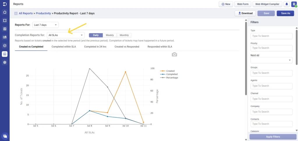
Productivity reports
Created vs Completed
The ‘Created vs Completed’ graph displays the number of tickets that were created compared to the number of tickets that were completed within a particular time frame.
There are numerous filter options available, allowing you to view the charts according to your specific needs.
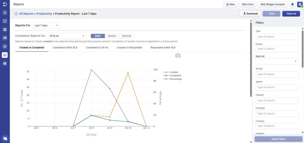
As seen in the screenshot above, ticket creation peaked on July 10 with 27 tickets created, while only a small number were completed that day. However, looking at July 8 and July 9, the gap between created and completed tickets was narrower—indicating better workload handling during those days. This suggests that while ticket volume may fluctuate, the team is showing signs of improving their ability to close tickets promptly.
Completed within SLA
The ‘Completed within SLA’ graph allows you to see the number of tickets that were completed, as well as the number of tickets that were completed within the designated SLA deadline.
This graph enables you to easily compare the data between the two and assess your team’s ability to meet the specified deadlines.
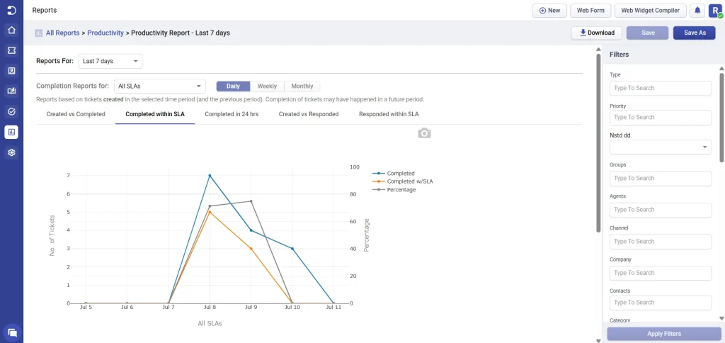
From the screenshot, you can see there’s a spike in tickets completed and completed within SLA on July 8, followed by a gradual decline over the next few days. While the high SLA compliance on July 8 is a positive sign, the dip afterward suggests room for improvement in maintaining consistency. Monitoring these trends regularly can help identify patterns and optimize team performance.
Completed in 24 hours
The ‘Completed in 24 hours’ graph allows you to see the number of tickets that were completed within a 24-hour time frame compared to the total number of tickets completed.
This graph offers valuable insights into your team’s performance in providing timely service to your customers.
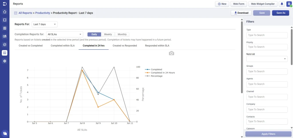
Based on the screenshot, there was a strong performance on July 8, with nearly all completed tickets being resolved within 24 hours. However, the following days show a noticeable decline in same-day resolution rates, indicating inconsistency. These fluctuations highlight the need to review daily workflows and identify any bottlenecks affecting rapid ticket resolution.
Created vs Responded
The ‘Created vs Responded’ report shows how many tickets were created versus how many received a first response in a given time frame. It’s a great way to evaluate whether your team is keeping up with incoming ticket volume and maintaining timely customer communication.
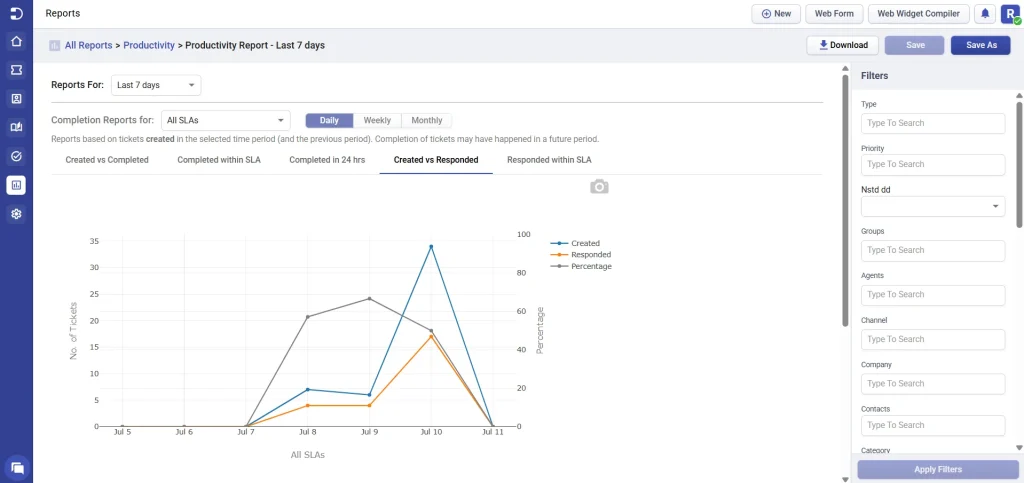
From the screenshot, you can see that while there was a spike in ticket creation on July 10, the number of responses also rose significantly — showing your team was able to catch up and respond to a high volume. A dip toward the end suggests a return to normal levels, but the response rate remains strong overall.
Monitoring this trend helps ensure no ticket goes unanswered and gives early warning signs if volumes are rising faster than your team can handle.
Responded within SLA
The ‘Responded within SLA’ report helps track the number of tickets that received a first response within the defined SLA time frame. This metric is especially useful for understanding how responsive your team is — not just in closing tickets, but in acknowledging customer concerns quickly.
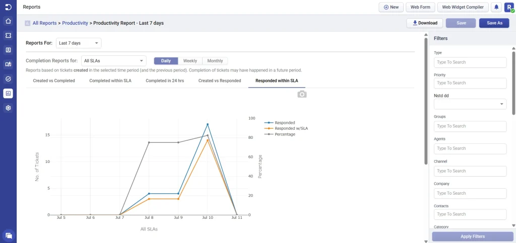
From the screenshot, you can observe that the number of tickets responded to and responded within SLA has steadily increased over time, with the latest period showing near-perfect SLA compliance — a strong indicator of improved responsiveness and team efficiency.
You also have the option to display charts for all the various graphs on a daily, weekly, or monthly basis.
Moreover, you can view completion reports for either all Service Level Agreements (SLAs) or choose a specific SLA to observe your team’s performance in meeting those particular deadlines.
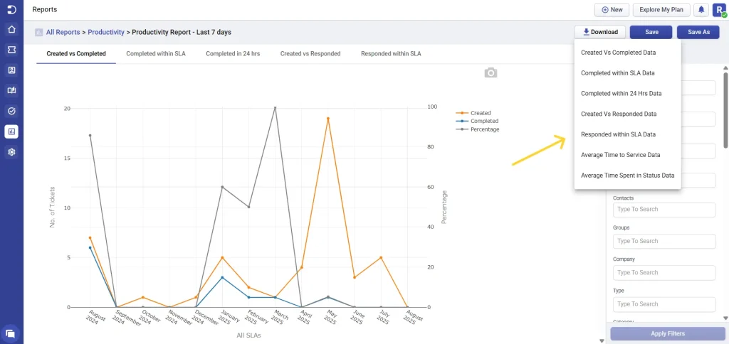
Downloads
In addition, you have the ability to download report data in CSV format. All of these graphs are presented in visually appealing formats, making it easy to understand and interpret the data. There are six download options available for you in productivity reports.
(i) Created vs completed data: Get a summary of the number of tickets created versus the number of tickets completed for a specific time period of your choice. This information is accessible in an Excel sheet format as a .csv file.
(ii) Completed within SLA data: Get a summary of the number of tickets that were completed versus the number of tickets that were completed within the SLA (Service Level Agreement) for a time period that you select. This data can be accessed in an Excel sheet format as a .csv file.
(iii) Completed within 24 hrs data: Get a summary of the total number of tickets completed compared to the number of tickets completed within 24 hours for a specific time period of your choosing. This summary is available in an Excel sheet format as a .csv file.
(iv) Created vs responded data: This report highlights the number of tickets created versus the number that received an initial response within the selected time frame. It’s a key indicator of how efficiently your team is acknowledging new tickets and keeping up with incoming workload—helping ensure no customer query goes unnoticed.
(v) Responded within SLA data: This report shows how many tickets received their first response within the defined SLA time window, a critical factor in reducing customer wait times and improving the overall support experience.
(vi) Average time to service data: Get several crucial metrics such as first assigned time, first replied time, resolved time, closed time, and more by exporting Average Times Data as an Excel sheet in .csv format.
(vii) Average time spent in status data: Provides the average time spent in each ticket status, helping you assess where time is being spent across different ticket stages.
There are also additional options, such as ‘Save as’ and ‘Save’, similar to other reports, which can help you save time when creating a new report.
Average times report
One of the key metrics you can measure with Desk365’s productivity reports is the average time taken to service customers across all filtered agents and tickets created in the chosen time period. By filtering your reports by agent or ticket type, you can see how long it takes your team to provide service to your customers across all of your help desk interactions.
This data is invaluable when it comes to optimizing your team’s workflows and identifying areas where they can improve.
You have the flexibility to measure the average time taken to service customers in hours, days, or minutes based on your preferred way of viewing the data. Additionally, the average time for tickets created can be calculated using business hours when applicable. This ensures that the metrics reflect the actual working hours of the support team, providing a more accurate representation of their performance and helping businesses to set realistic expectations and goals.
Additionally, the average time for tickets created can be calculated using business hours when applicable. This ensures that the metrics reflect the actual working hours of the support team, providing a more accurate representation of their performance and helping businesses to set realistic expectations and goals.
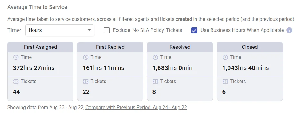
Desk365’s productivity reports also allow you to track first assigned, first replied, resolved, and closed times.
Let’s cover each of these metrics in detail below.
First assigned time:
This refers to the time when a ticket is first assigned to a specific support agent or team within the help desk system.
First replied time:
This refers to the time when a support agent or team sends the first response to the customer who submitted the ticket. This is the amount of time it takes for your team to respond to a customer’s initial request for help. By monitoring this metric, you can ensure that your team is providing quick and efficient service to your customers. This, in turn, can lead to higher customer satisfaction and loyalty.
Resolved time:
This refers to the time when the support agent or team has successfully resolved the customer issue and the ticket gets marked as ‘resolved’ by the agent.
Closed time:
This refers to the time when the support agent or team has marked the ticket as “closed” in the help desk system, indicating that the issue has been resolved and no further action is required.
Note: Archived tickets are fully integrated into Productivity Reports and are categorized under closed tickets status. This ensures that they are considered in all data and performance analyses related to closed tickets.
As you see from the screenshot above, the ‘First Replied’, ‘Resolved’, and ‘Closed’ times have significantly improved in your current time period. This is encouraging news for your support team.
Tracking these times can be helpful for both the support team and the customers, as it provides insight into the responsiveness and efficiency of the support process.
It is recommended that you continue to measure this data regularly to ensure that your support team maintains these standards. You can also use this data to set goals for your team and track their progress over time.
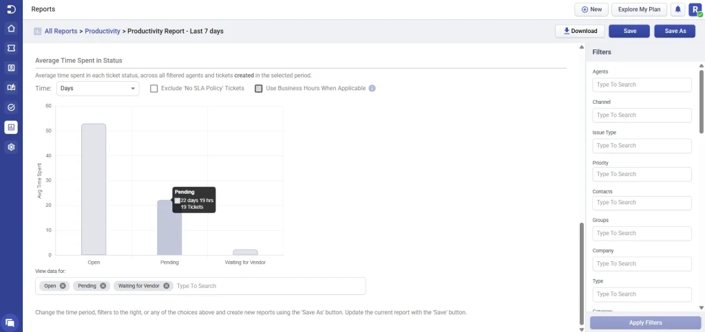
Average time in status report
The productivity reports include insights on the average time tickets spend in each status (such as Open, In Progress, Escalated, Waiting on Customer, and others). This helps you identify how long tickets remain in a specific stage of the workflow and can highlight areas where delays frequently occur.
You can choose to filter the results based on hours, days, or minutes, exclude tickets without an SLA policy, and apply Business Hours where applicable.
For statuses like Resolved and Closed, time spent is not calculated, since these tickets are no longer consuming active support time.
Desk365’s productivity reports provide businesses with accurate and detailed data that can help them make informed decisions and improve their team’s performance.
With real-time tracking, beautiful and interactive charts, customizable reports, Desk365’s productivity reports are an essential tool for businesses of all sizes.
By monitoring these times, support teams can identify areas for improvement and ensure that they are meeting their service level agreements (SLAs) with customers.